 |
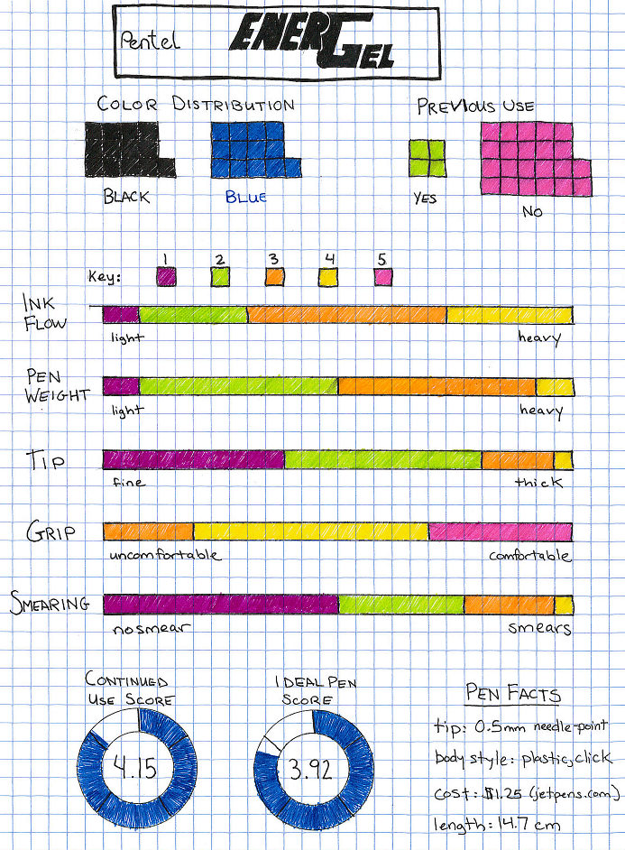
| (Each square represents one person.) |
 |
| (I didn't want the right side to look as long as the left side when the list of criticisms was actually shorter, so I colored some of the lesser worst aspects blue because it seemed like the right thing to do at the time.) |
 |
| (No significance to blue or black text.) |


3 comments:
good presentation, rachel!
I just love your art work for this set of survey results.
I'm glad other people thought the "you are not a robot" math was hard too!
Post a Comment